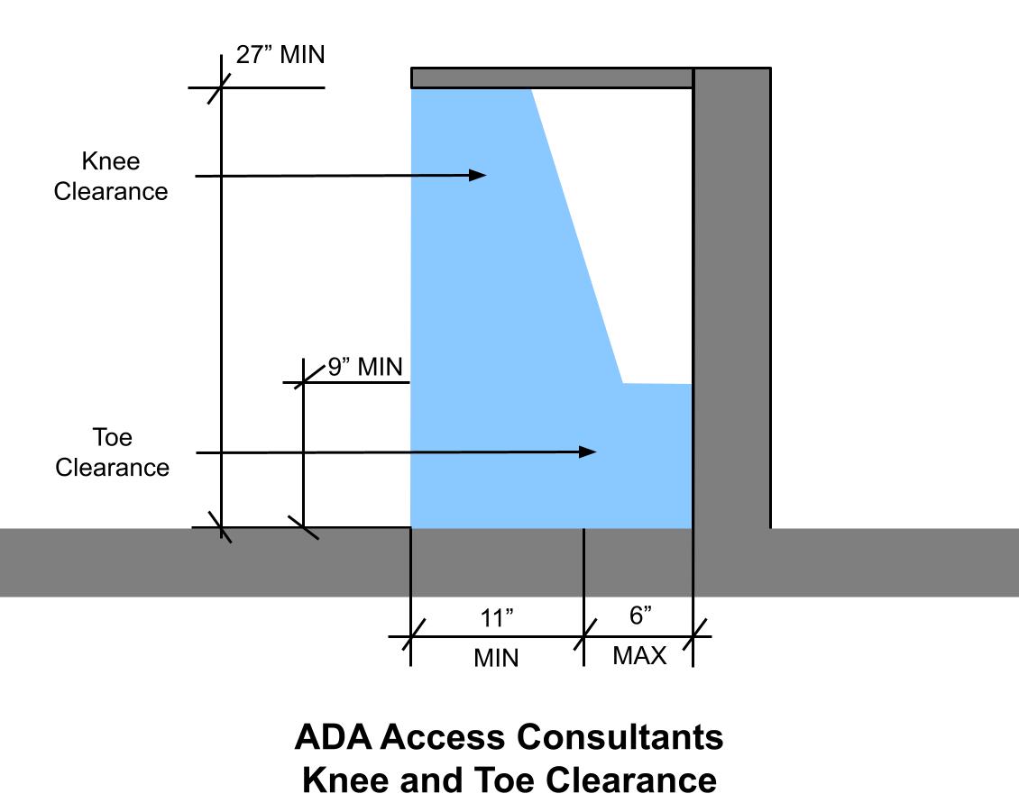
ADA Knee and Toe Clearance Requirements for Businesses What is Knee and Toe Clearance? ADA knee and toe clearance requirements refers… <a class="continue" …

Received an ADA Lawsuit? A Business Owner’s Step by Step Guide If you’ve received an ADA lawsuit and don’t know… <a class="continue" …
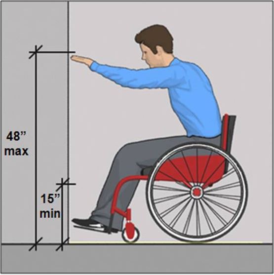
ADA Reach Range Requirements Reach range requirements are the required dimensions and placement of accessories and accessible elements to ensure… <a class="continue" …
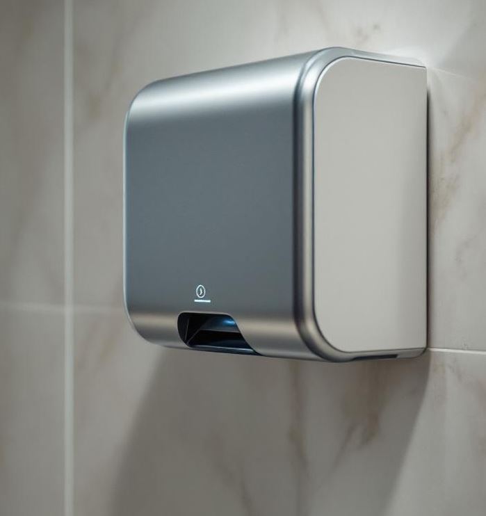
Guide to ADA Toilet Accessories What Are ADA Toilet Accessories? In a bathroom or toilet facility, ADA compliant toilet accessories… <a class="continue" …
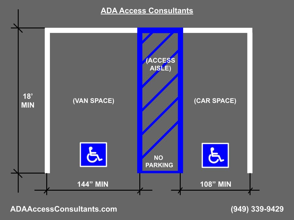
ADA parking is an important part of any accessible route. To be accessible, parking stalls require specific width, length, and slope. Continue Reading ADA Parking Guide
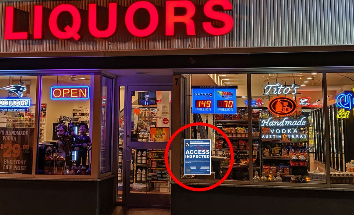
An ADA inspection certificate is issued when a property is inspected by a licensed CASp. Call to get your ADA inspection certificate today. Continue Reading ADA Inspection Certificate
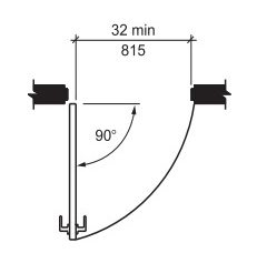
ADA Door Requirements What are ADA Door Requirements? ADA door requirements refers to the clear floor space, door dimensions, and… <a class="continue" …
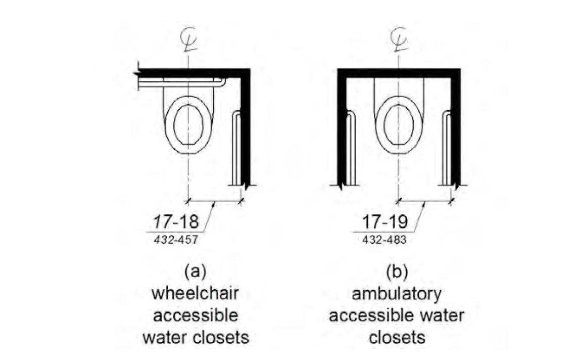
ADA Bathroom Requirements allow for an accessible property to all. CASp inspectors at ADA Access Consultants help you get ADA compliant. Protect your self legally... Continue Reading ADA Bathroom Requirements